DevLog 9: Skill Variations, Menu UI Updates
Happy March ' 25 Ya'll,
Since I started this project I have been trying to figure out some way inject more of Sword Art Online influenced mechanics into Grimoire's battle system. At the end of 2024 I began work tweaking how skills are affected by battle position. As I've continued to build out these mechanics it has also become more apparent that the Minimalist Main Menu stylings clashes with the Battle UI.
This DevLog will cover Skill Variations and the in progress Menu UI Updates.
Position Based Skill Variations
Skills are impacted by the range of the weapon equipped. Bows can generally reach farther, while melee weapons like Swords only work within arms reach/ the column ahead. Sword Art Online features a slightly emphasized "Switch" mechanic that involves paired up Party Members swapping positions. I have translated this into a "Assault" and "Support" role in battle. If you've been following along, this concept isn't the newest as the party is already set up in a 2x2 formation:
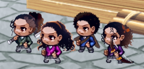
Position variations take party formations a step further.

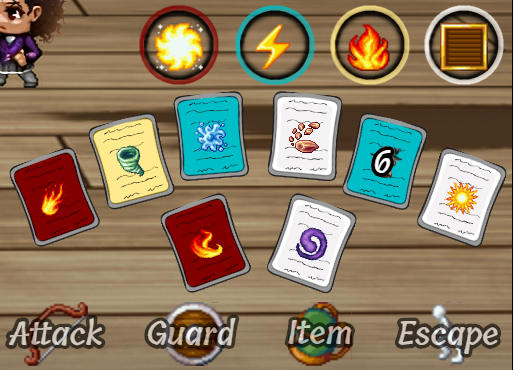
When equipping skills, some might have Assault (blue) and Support (yellow) descriptions displayed. By default, Front Row Actors can only use the Assault variationof the skill, Back Row only the Support variation. Players will eventually find additional grimoires they can use to force use of one variation or another no matter what position the Actor is in. Generally, support skills will emphasize aiding Row Partners, while Assault skills focus on targeting the enemy troop.
While not every skill will have a position variation, this update will adds a new layer to battle strategy and set up. In battle only the variation description accessible to that actor will be shown in the help window to reduce confusion.
Menu UI Updates
Early on I made the decision that I wanted a simple and clean UI. No frills, no major colors pops, no..
No fun.
At all.
This was fricken boring. I tried updated window skins to add a little more pizzaz, but ultimately the conflict I identified most was with with the Battle UI. The Battle UI doesn't shy away from color and uses color for visual cues about skills, as well as giving space for what would normally be a simple text based menu for things like Attack and Guard.
This is a world where magic is fairly entwined in the lives of its characters. I wanted to figure out a happy medium of sorts, to bring the overall flavor of the Battle UI into the other menus. And so we've arrived so far at:
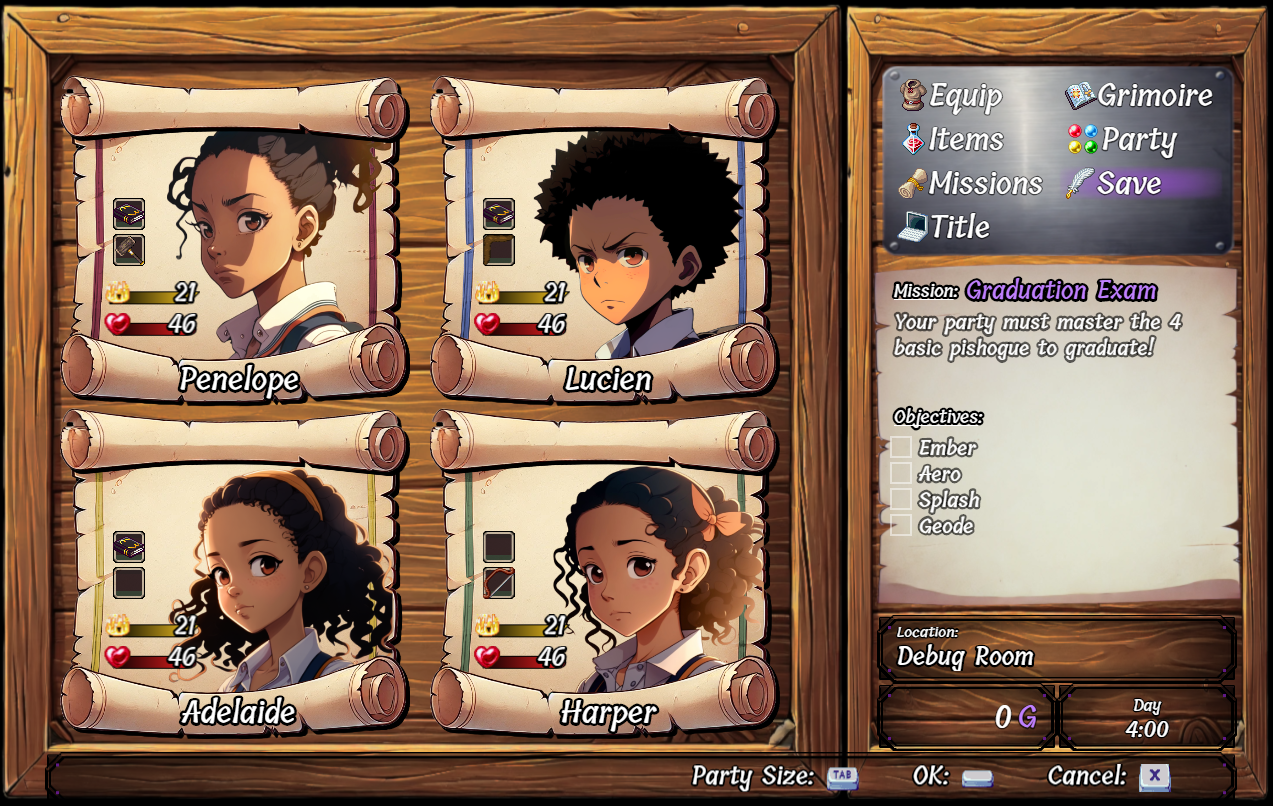
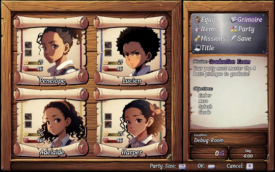
As much of the story will be driven by The Four taking on missions, I felt a mission board motif would work. well. I carried over the color visual cues to better articulate current battle position to the point of the scroll changing color when that actor is being highlighted. I am still finalizing the right section. Once complete, I'll see about how the other menus will be updated to bring this theme to the rest of the games menu UI.
What do you think of the updates so far? Did you prefer the simplified Menu theme? Does change scare you as much as it scared me for the last 2 years leading to all this new vibrant color? How about the new skill variations? What sort of Support variation would you do for a basic Air type skill?
Let me know ^_^
See You Online!
- Puppet
Leave a comment
Log in with itch.io to leave a comment.